The following is a case study from past Logo Design Awards winner Hyperquake (winner in the identity applications category). Check out other great logo design from past winners, and be sure to enter your work by Nov. 4, 2016!
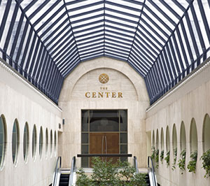
At the heart of downtown Cincinnati sits The Center, a former museum of contemporary art turned contemporary event space. With a brand that didn’t quite reflect its heritage and purpose—and actually pigeonholed it as a wedding-only venue—The Center approached local brand evolution agency Hyperquake. The objective? To design an identity that would both elevate The Center’s profile and take into consideration the wide range of events that are held there, from weddings and receptions to parties and corporate events.
An Investigative Process
“Our initial session with our clients was spent listening to their hopes and concerns for The Center’s new brand—something timeless, nothing too feminine or masculine, something reflective of the space and its history,” says design director Holly Shoemaker. “The foundation of this project was extensive research into their target consumers and their competitors’ brand positioning; we even visited other event venues to sniff out the way they presented themselves, and potential points of difference for The Center. The research culminated in the development of a strategic brand position, from which the visual identity work naturally evolved.”

An exploration of The Center’s competition, including competing local venues, caterers and vendors. The Center’s original logo is center.

An early wall of inspiration for palette, typography, patterning and logo with some rough notes.

An in-progress design theme Hyperquake shared with its clients. This inspiration enabled them to have a constructive conversation about what the client loved and disliked before diving into the design phase.
When they were ready to create, the team returned to The Center to investigate every nook and cranny. “We photographed each and every light fixture, ceiling detail [and] countertop material that might inspire a graphic element in the identity,” says designer Emily Zalla. “Back at our studio, we printed the photos, spread them out in a room, and started loosely sketching out shapes, colors and typography that might speak to the space.” From the many ideas that were tossed around, one observation stuck: The Center is made up of an abundance of circular features, from its signature dome to its light fixtures. “With that inspiration, we were off and running,” Zalla says.

Rough logo and palette directions that Hyperquake initially explored. Both of these softer directions were abandoned in favor of the final graphic concept because it better captured the timeless, gender-neutral and architectural atmosphere of The Center.

So inspired was the team that they jumped straight to developing three bold, geometric patterns constructed from circles. From that, they distilled a symmetrical icon that correlates with each pattern. And throughout the process, they were excited to bring other creatives into the mix, as well, collaborating with photographer Adam Leigh-Manuell for four photoshoots of The Center’s space, and also partnering with local screenprinting shop DIY Printing to handprint brand guideline books. “There’s nothing like getting our hands dirty, collaborating with other creative professionals, to bring new dimension to a design project,” Zalla says.
The entire process went very smoothly thanks to superb communication. “Our team put a great deal of effort into ensuring that our clients were included at every step of the process,” Shoemaker says, adding that because the venue was only a few minutes away from the agency, they were able to meet in person frequently.
The Final Design
Thanks to the team at Hyperquake, The Center’s logo now reflects The Center’s architectural details, as well as the space’s location within the city. Furthermore, the pairing of a humanist serif with a contemporary sans is nod to the building’s history, according to the creative team.
“A flexible, geometric pattern series speaks to The Center’s strategic positioning as the only customizable ‘blank canvas’ venue in Cincinnati,” Shoemaker notes, adding that “an elegant, neutral-and-blush palette reinforces the venue’s historical gravitas, while inviting clients to flex their creative muscle and bring a modern touch to each event.”
The Hyperquake team is proud that the logo and identity genuinely reflect The Center and those working there. “It’s rare to be able to capture so much in a few simple lines,” Zalla says, “which speaks to how powerful this venue’s story really was.”
The Cincinnati community would agree. Shoemaker notes that The Center has enjoyed increased recognition through both word of mouth and social sharing, which has resulted in increased bookings for the venue. “Beyond that, our clients developed a renewed enthusiasm for spreading their brand, and that’s priceless,” she adds.

Key Learnings
Shoemaker and Zalla each took away a solid lesson from this project.
Zalla: “The execution of an identity over time is much more important than the way it looks on screen during your logo pitch. Some companies will have an in-house design team, or a hired agency, to execute its collateral or campaigns in accordance with your design intent. Others, like The Center, won’t. When that’s the case, it’s not something to complain about; it’s a design challenge. What can you do to simplify the identity without losing its power? Many of our collateral designs were simple enough to print on an office printer in Word, but we connected our client with a beautiful blush paper to elevate the design of any correspondence they sent. We create multiple complex patterns, but we executed them as tileable blocks our client could drag and drop without worrying about scale or line weight. The client will be happier for your effort, and you can be assured your brand won’t fracture over time.”

Shoemaker: “Most clients didn’t attend design school, and they might not have the design vocabulary to express exactly what it is about your sketch that they don’t love. That doesn’t mean you should brush them off. Listen for what they mean, not what they’re saying—don’t stop asking ‘why’ until you find an answer that speaks to you. Your client can be the one of the best resources you have in the design process, if you know how to ask the right questions.”
In light of their win, they also want to share with fellow designers an observation about logo design. “Every design shop sells itself on a process, but flexibility in that process is crucial,” Shoemaker says. “If a designer follows the same process for every logo she makes, it could cut her off from the most interesting options.” As an example, she references how The Center’s flexibility and rhythmic circular details inspired them to create a series of patterns made up of circles. “Because we took that chance to jump ahead in the process, we were able to distill a logo out of the patterning—resulting in a really cohesive look. If your design process feels stale or stuck, try flipping parts of it around. You could end up with something totally weird—or something totally new.”